Strike-Through Pricing Psychology: The Complete Display Guide
Strike-through pricing increases purchase intent by 20-30%. But checkout-only discounts kill conversions. Learn why showing the discounted price on product pages—not after code entry—transforms your conversion rates.

Muhammed Tüfekyapan
Key Takeaways
- 1 Strike-through pricing increases purchase intent by 20-30% compared to showing sale price alone
- 2 Checkout-only discounts kill conversions—customers can't calculate '10% off $127.50' in their heads
- 3 Product page price visibility boosts conversion 25-40% vs checkout-only discount reveals
- 4 WELCOME10 codes fail because customers see full price until checkout—no visual confirmation of savings
- 5 Rule of 100: Under $100 show percentage off, over $100 show dollar savings for maximum impact
- 6 Growth Suite's native product page elements show personalized prices with countdown timers—no math required
Your discount is worthless if customers can't see the value. Strike-through pricing shows customers exactly what they're saving. It turns a simple "$80" into a powerful "~~$100~~ $80" that drives action.
But here's the problem most stores miss: if you hide the discount until checkout, customers never see the real price. They don't understand "10% off $127.50." They need to see "$114.75" right on the product page. Understanding compare at price psychology can transform your conversion rates.
What Is Strike-Through Pricing?
Strike-through pricing is a visual technique that shows the original price crossed out next to the sale price. You've seen it everywhere: ~~$100~~ $80. That simple line through the old price creates powerful psychology.
In Shopify, this works through the "Compare At Price" field. You set the original price as Compare At, and the lower selling price shows next to it. The theme automatically displays the crossed out price with a line through it.
| Price Display Type | Example | Visual Impact |
|---|---|---|
| Sale price only | $80 | Low - no context |
| With strike-through |
|
High - clear savings |
| With percentage | $80 (20% off) | Medium - requires math |
| With dollar savings | $80 (Save $20) | High - concrete value |
Key Insight:
A price without context is just a number. Strike-through pricing gives customers the reference point they need to recognize value. The crossed out price becomes the anchor that makes the sale price feel like a deal.
The Psychology of Price Anchoring
Why does strike-through pricing work so well? The answer is price anchoring. This is a psychological principle where the first number someone sees becomes their reference point for everything after.
When customers see ~~$100~~ $80, the $100 becomes the anchor. Their brain thinks: "This is a $100 product that I'm getting for $80." Without that anchor, $80 is just... $80. No context. No urgency. No deal.
How Anchoring Changes Perception
| Scenario | Customer Sees | Perceived Value |
|---|---|---|
| No anchor | "$80 product" | $80 seems like actual value |
| With anchor | " |
$80 feels like a bargain |
| High anchor | " |
Suspicious - too good |
| Low anchor | " |
Not worth the effort |
Research Finding:
Studies show that reference pricing with strike-through displays increases purchase intent by 20-30% compared to showing sale price alone. The anchor creates the perception of value that drives buying decisions.
The Hidden Problem: Checkout-Only Discounts
Here's the biggest mistake stores make with discounts: hiding the discount until checkout. You send customers a code like "SAVE20." They browse your product page, see "$100," add it to cart. They hope the code will work. They're not sure what they'll actually pay.
This creates what we call "discount uncertainty." The customer knows there's a discount somewhere. But they don't see it until the very end. By then, many have already abandoned.

The Math Problem
When you say "20% off," customers have to do math. "20% of $127.50 is... wait, let me get a calculator..." Most won't. They see "$127.50" and assume that's what they'll pay. Your discount becomes invisible.
| Discount Visibility | Customer Experience | Conversion Impact |
|---|---|---|
| Product page (native) | Sees $80 immediately | Highest conversion |
| Cart page | Adds at $100, sees $80 in cart | Medium conversion |
| Checkout only | Adds at $100, hopes code works | Lowest conversion |
| Email/popup only | "Use SAVE20" - no price context | Very low conversion |
The Uncertainty Tax:
Every moment of discount uncertainty costs you conversions. "Use code SAVE20" creates uncertainty. "Sale price display: $80" eliminates it. Show customers what they'll pay, not a math problem to solve.
Why "WELCOME10" and "SAVE20" Codes Fail
Let's talk about those popular discount codes. WELCOME10. SAVE20. FIRST15. They seem helpful—the percentage is right in the name! But they fail at discount price visibility.
Here's why: the customer still sees full price on the product page. They see "$100." They know they have a code for "10% off." But what does that mean? Is the final price $90? Maybe. They're not sure. They add to cart. They go to checkout. They hope the code works.
The Customer's Confusion
| Code Type | Product Page Shows | Customer Understands |
|---|---|---|
| WELCOME10 | $100 | "Maybe $90?" - Uncertain |
| Generic code | $100 + "Use code" | No idea of final price |
| Compare At |
|
"I'll pay $80" - Clear |
| Native display | "Your Price: $80" | "I'll pay $80" - Confident |
Why Generic Codes Hurt Conversions:
- No visual confirmation: Customer sees full price until checkout
- Math required: "15% off $127.50" requires calculation
- Code friction: Must copy-paste correctly
- Uncertainty: "Will this code actually work?"
- Late reveal: Discount appears too late in the journey
Unique & Single-Use Codes: Stop the Leakage
Your SAVE20 code has 3,000 uses—you created it for 1,000 customers. Static codes leak everywhere. Learn why unique, single-use, auto-expiring codes are the only professional way to discount.
The Power of Immediate Price Visibility
When customers see the discounted price immediately on the product page, conversion rates jump by 25-40% compared to checkout-only discounts. This is the power of discount price visibility.
Why? Because immediate price visibility eliminates uncertainty. The customer knows exactly what they'll pay. No hoping. No calculating. No surprises at checkout. They see "Your Price: $80" and they're confident.
| Display Location | Time to Value Recognition | Conversion Impact |
|---|---|---|
| Product page | Immediate | +25-40% vs checkout-only |
| Cart page | After add to cart | +15-20% vs checkout-only |
| Checkout page | After starting checkout | Baseline |
| Email only | Never (until code applied) | -20-30% vs product page |
Conversion Insight:
When customers see the discounted price immediately on the product page with strike-through pricing, conversion rates improve by 25-40% compared to checkout-only discount visibility. Show the price where decisions happen.
Compare At Price: Shopify's Built-In Solution
Shopify has a built-in solution for was now pricing: the Compare At Price field. You set the original price in the Compare At field, and the lower selling price shows next to it. Your theme automatically displays the crossed out price.
This works great for static sales. But it has limitations. The Compare At price is the same for everyone. There's no urgency. No countdown. No personalization.
| Feature | Compare At Price | Dynamic Display |
|---|---|---|
| Setup | Manual in admin | Automatic |
| Personalization | Same for everyone | Per-visitor |
| Urgency | None | Countdown timer |
| Flexibility | Change each product | Campaign-based |
| Ad sync | Yes (native price) | Depends |
Compare At Limitation:
Shopify's compare at price psychology works well for store-wide sales. But it's static—the same for every visitor. For personalized offers with real urgency, you need a dynamic solution that shows different prices to different customers.
Legal Requirements for Strike-Through Pricing
Before you add strike-through pricing to your store, you need to understand the legal requirements. The FTC in the United States—and similar authorities worldwide—have strict rules about was now pricing.
The core rule is simple: your "was" price must be genuine. You can't inflate the original price to make the discount look bigger. The product must have actually sold at that higher price recently.
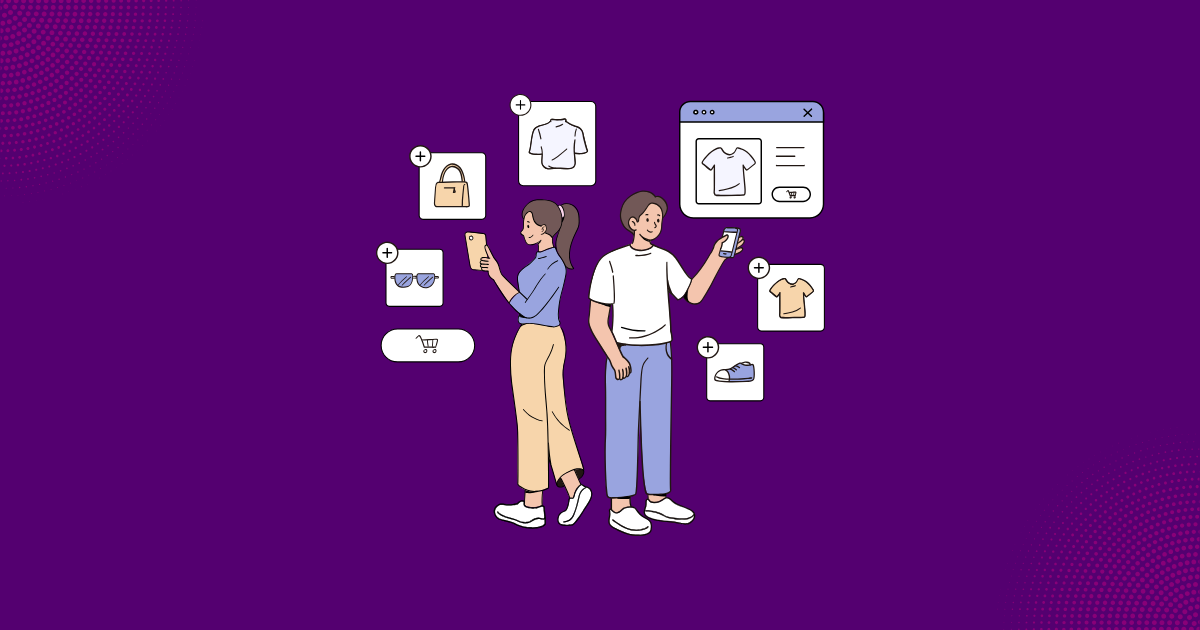
9 Best Shopify Discount Apps: Find the Right One for YOUR Problem
Stop browsing feature lists. 9 premium apps compared by the 7 problems they solve—not rankings, not reviews, just honest "use this when..." guidance. Find your perfect match in minutes.
International Requirements
| Jurisdiction | Key Requirement | Risk of Violation |
|---|---|---|
| USA (FTC) | Must have sold at higher price "recently" | Fines, class actions |
| EU | Original price = lowest in 30 days | Consumer protection fines |
| UK | Similar to EU post-Brexit | Trading Standards action |
| Australia | Must not be misleading | ACCC penalties |
Legal Warning:
Never inflate your Compare At price to make discounts look bigger. The original price in your crossed out price display must reflect genuine previous pricing. Violations can result in significant fines and legal action.
Native vs. Popup Discount Displays
How you display discounts affects how customers perceive your brand. Aggressive popups scream "desperate." Native sale price display elements look professional and trustworthy.
Think about it from the customer's perspective. A spinning wheel popup that says "WIN 20% OFF!" feels cheap. A clean price display that shows "Your Price: $80" feels premium. Same discount. Very different brand perception.
| Display Type | Brand Perception | User Experience |
|---|---|---|
| Aggressive popup | "Desperate, spammy" | Intrusive, annoying |
| Banner/announcement | "Promotional" | Easy to ignore |
| Native product element | "Professional, premium" | Seamless, trustworthy |
| Cart drawer integration | "Thoughtful, helpful" | Contextual |
Brand Integrity:
Ugly popups cheapen your brand. A native sale price display that matches your theme builds trust. Premium brands need premium presentation. The way you show the discount matters as much as the discount itself.
Auto-Apply Discount Codes: Kill the Copy-Paste Problem
Your customer has a code but struggles to apply it—so they open Honey. Learn how auto-apply unique codes eliminate copy-paste friction, prevent coupon extension hijacking, and boost mobile conversions.
How to Show Savings Effectively: The Rule of 100
Should you show "25% off" or "Save $25"? The answer depends on your product price. The Rule of 100 gives you a simple guideline for reference pricing displays.
For products under $100, show percentage off. "25% off" looks bigger than "Save $20" on a $80 product. For products over $100, show dollar savings. "Save $50" feels more substantial than "15% off" on a $350 item.
| Product Price | Better Format | Why |
|---|---|---|
| Under $100 | "25% off" | Larger number looks better |
| Over $100 | "Save $50" | Dollar amount feels substantial |
| High-ticket ($500+) | Both: "Save $150 (25%)" | Reinforces value both ways |
| Bundle | "Save $120 on set" | Justifies bundle purchase |
The Rule of 100:
Under $100 → Show percentage | Over $100 → Show dollars
Example:
$80 product with 25% off → Show "25% off" (bigger number)
$200 product with 25% off → Show "Save $50" (more concrete)
How Growth Suite Transforms Discount Visibility
Growth Suite solves the discount price visibility problem with native product page elements. When a visitor receives a personalized offer, a beautiful element appears on every product page—showing them exactly what they'll pay.
This isn't a popup. It's a native element that matches your theme. It looks like it was custom-coded for your store. And it shows the customer everything they need: their personalized price, the countdown timer, and exactly how much they're saving.
What Customers See with Growth Suite
Native Product Page Element Shows:
- Personalized offer notification: "You have a special offer!"
- Time limit: "Valid for the next 15 minutes"
- Live countdown: 14:32... 14:31... 14:30...
- Discount amount: "15% off this product"
- Your price: "$85" (not "use code for 15% off")
-
Original price:
$100with clear savings display
| Feature | Generic Code (WELCOME10) | Growth Suite Display |
|---|---|---|
| Product page | Shows full price only | Shows personalized price |
| Price clarity | "10% off... so $90?" | "Your Price: $90" - crystal clear |
| Urgency | None | Live countdown timer |
| Personalization | Same for everyone | Unique to each visitor |
| Brand fit | External code, promotional | Native element, matches theme |
| Trust | "Will this code work?" | "This is my price" |
Growth Suite Advantage:
When a visitor receives an offer, a native element appears on every product page showing their personalized strike-through pricing: the original price crossed out, their special price, and a live countdown. No math required. No code to remember. Just "Your Price: $80."
Measuring Price Display Impact
How do you know if your sale price display is working? Track these key metrics to understand the impact of your price visibility strategy.
| Metric | Checkout-Only | Product Page Display |
|---|---|---|
| Add-to-Cart Rate | Baseline | +15-25% |
| Conversion Rate | Baseline | +20-35% |
| Cart Abandonment | Higher (uncertainty) | -10-15% |
| Time to Purchase | Longer (hesitation) | Shorter |
Key Metrics to Track:
- Discount seen rate: What % of visitors see the discounted price?
- Add-to-cart rate: Does showing price on product page increase adds?
- Conversion rate: Do visible discounts convert better?
- Cart abandonment: Does price clarity reduce abandonment?
- Time to purchase: Do customers decide faster with visible pricing?
Implementation Best Practices
Whether you use Shopify's Compare At or a dynamic solution, follow these best practices for strike-through pricing implementation.
Mobile-First Design
More than 60% of shoppers browse on mobile. Your crossed out price must be clearly visible on small screens. Test on actual devices, not just desktop preview.
| Best Practice | Why It Works |
|---|---|
| Red sale price | Draws attention, signals urgency |
| Strike-through in gray | Clearly "cancelled" without distraction |
| Bold sale price | Hierarchy shows final price is key |
| Savings badge near price | Reinforces value proposition |
| Mobile-optimized display | 60%+ of cart views are mobile |
Mobile First:
Over 60% of shoppers browse on mobile devices. Your compare at price psychology display must work perfectly on small screens. If customers can't see the crossed out price clearly on mobile, you're losing conversions.
Summary: Price Display Psychology
- Strike-through pricing creates anchors — The crossed out price becomes the reference point that makes the sale price feel like a deal. Price anchoring drives purchase decisions.
- Checkout-only discounts kill conversions — When customers can't see the final price until checkout, they abandon. Show the discounted price on the product page.
- WELCOME10 codes fail at visibility — "Use code for X% off" requires math. "Your Price: $80" requires none. Eliminate uncertainty.
- Native displays beat popups — Premium brands need premium presentation. A native sale price display builds trust; aggressive popups destroy it.
- Use the Rule of 100 — Under $100, show percentage. Over $100, show dollars. Display savings in the format that looks most impressive.
- Growth Suite shows personalized prices — Native product page elements display the actual price customers will pay, with countdown timers and no math required.
What if every discount went to the right person?
Growth Suite predicts purchase intent and shows time-limited offers only to visitors who need them.
In This Article
References & Sources
Research and data backing this article
Muhammed Tüfekyapan
Founder of Growth Suite
Muhammed Tüfekyapan is a growth marketing expert and the founder of Growth Suite, an AI-powered Shopify app trusted by over 300 stores across 40+ countries. With a career in data-driven e-commerce optimization that began in 2012, he has established himself as a leading authority in the field.
Stop giving discounts to everyone.
Growth Suite watches each visitor, predicts purchase intent, and makes one real, time-limited offer—only to those who need it.
Try Free for 14 DaysContinue Reading
More articles you might enjoy
Deep Dive: The Ultimate Guide to Percentage Off Discounts
Deep Dive: The Ultimate Guide to Fixed Amount Discounts
Percentage Off vs. Fixed Amount Discounts: Which Converts Better?

Tiered Discounts Strategy: Spend More, Save More
Deep Dive: Buy X Get Y (BOGO) Guide

Free Gift with Purchase (GWP) — The "No-Discount" Strategy
Frequently Asked Questions
Common questions about this topic