Sticky Bars & Countdown Timers: The Complete High-Visibility Guide
Customers forget your discount after 2-3 pages. Sticky countdown timers keep offers visible—but aggressive timers destroy trust. Learn how to create non-intrusive urgency that converts without annoying your mobile shoppers.

Muhammed Tüfekyapan
Key Takeaways
- 1 Customers forget discount offers after browsing 2-3 pages—persistent timers increase redemption by 25-40%
- 2 Aggressive countdown timers cause 25% of visitors to leave immediately—minimized icons work better
- 3 60%+ of e-commerce traffic is mobile—sticky timers must use less than 5% of screen space
- 4 Progressive disclosure design: show full timer for 1.5 seconds, then minimize to circular icon
- 5 Fake timers that reset on refresh destroy customer trust forever—server-synced accuracy is essential
- 6 Growth Suite's sticky timer appears on every page with click-to-expand popup for full campaign details
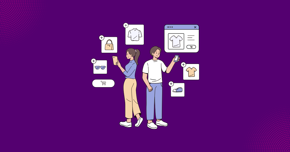
Your customer gets a 15% discount offer on the homepage. They browse 4 products. Now they are on the cart page. Do they remember the offer? Do they remember the time limit? Most do not. This is where sticky bar discounts and countdown timer urgency save the day.
A sticky countdown keeps your offer visible on every page. It reminds customers without annoying them. The problem is simple: if customers cannot see your offer, it does not exist in their minds. But aggressive timers destroy trust and ruin user experience. The solution? A non-intrusive urgency element that stays visible but never blocks shopping.
In this guide, you will learn how to use floating timers, persistent discount bars, and mobile-friendly timers the right way. We will show you why aggressive countdowns backfire, how to design timers that work on mobile, and how Growth Suite's sticky timer creates urgency without the annoyance.
What Are High-Visibility Discount Elements?
High-visibility elements are design components that keep your discount offer visible as customers browse your store. These include sticky bar discounts at the header or footer, floating timers in the corner, and announcement bar discounts across the top of every page.
The purpose is simple. You want customers to see your offer at all times. When they see the offer, they remember it. When they remember it, they act on it.
Types of High-Visibility Elements
| Element Type | Position | Persistence | Best For |
|---|---|---|---|
| Announcement Bar | Header/Footer | Always visible | Store-wide sales, shipping |
| Floating Timer | Corner | Follows scroll | Individual countdowns |
| Sticky Sidebar | Side of screen | Scroll-triggered | Cart reminders |
| Minimized Icon | Corner | Always present | ✅ Personalized offers |
Key Insight:
A discount your customer cannot see is a discount that does not exist. The question is not whether to show urgency—it is how to show it without destroying the shopping experience.
The Psychology of Persistent Urgency
Why does countdown timer urgency work so well? The answer lies in human psychology. Two powerful effects drive customer behavior: the Zeigarnik Effect and loss aversion.
The Zeigarnik Effect
The Zeigarnik Effect says people remember incomplete tasks better than completed ones. When customers see a running countdown, their brain treats it as an open task. They feel compelled to finish it—by making a purchase before time runs out.
Loss Aversion
People fear losing something more than they enjoy gaining something. A persistent discount bar reminds customers what they will lose if time expires. This fear of missing out drives faster decisions.
| Urgency Display | Psychological Impact | Conversion Effect |
|---|---|---|
| Popup shown once | Quickly forgotten | ⚠️ +5-10%, fades |
| Static banner | Background noise | ❌ +2-5% at best |
| Persistent timer | Constant reminder | ✅ +15-25% sustained |
| Progressive timer (minimized) | Present but not annoying | ✅ +20-30% optimal |
Research Finding:
Customers make purchase decisions 40% faster when they see a visible countdown timer. But aggressive timers cause 25% of visitors to leave immediately. The balance is everything.
The Problem: Customers Forget Their Offers
Here is the truth most merchants miss. Your customer receives a discount offer. They browse your store. After 3-4 pages, they forget about the offer completely. No reminder means no urgency. No urgency means no sale.
The Browse-and-Forget Pattern
The average visitor views 4-6 pages per session. If you show your offer on page 1, most customers forget it by page 3. They get distracted by products, reviews, and comparisons. The offer fades from memory.
9 Best Shopify Discount Apps: Find the Right One for YOUR Problem
Stop browsing feature lists. 9 premium apps compared by the 7 problems they solve—not rankings, not reviews, just honest "use this when..." guidance. Find your perfect match in minutes.
Think about email discount codes. The customer receives "SAVE15" in their inbox. They click through to your store. But now they think: "What was that code again?" They cannot remember. They might search coupon sites instead of using your code.
| Scenario | Offer Memory | Likely Outcome |
|---|---|---|
| Offer shown once (popup) | Forgotten after 2-3 pages | ❌ Low redemption |
| Code sent by email | "What was that code?" | ❌ Abandoned or leaked |
| Banner at top (static) | Banner blindness after 30s | ❌ Ignored completely |
| Persistent but minimized | Constant visual reminder | ✅ High redemption |
The Memory Problem:
Your customer received a 15% offer on the homepage. They browsed 4 products. Now they are on the cart page. Do they remember the offer? Do they remember the time limit? Most do not.
Why Aggressive Countdown Timers Backfire
You might think bigger is better. Wrong. Aggressive countdown timers actually hurt your conversions. They create distrust, damage your brand, and drive customers away.
Banner Blindness
When you show large, constant elements, customers learn to ignore them. This is called banner blindness. The bigger and flashier your timer, the faster customers will tune it out.
The "Cheap Store" Perception
Large countdown timers covering 20% of the screen feel desperate. Premium brands do not scream at customers. Aggressive timers make your store look cheap and untrustworthy.
| Timer Style | Customer Perception | Brand Impact | UX Score |
|---|---|---|---|
| Full-screen countdown | "Desperate, spammy" | Severely negative | ❌ 2/10 |
| Large sticky bar | "Pushy, annoying" | Negative | ⚠️ 4/10 |
| Moderate floating timer | "Noticeable" | Neutral | ⚠️ 6/10 |
| Minimized progressive icon | "Professional, helpful" | Positive | ✅ 9/10 |
Warning:
A countdown timer covering 20% of the screen does not create urgency—it creates distrust. Premium brands use subtle urgency. Desperate brands scream.
The Mobile UX Dilemma
More than 60% of e-commerce traffic comes from mobile devices. This changes everything about mobile-friendly timer design. On small screens, every pixel matters.
Screen Real Estate is Limited
On a 375px-wide screen, a "small" 100px timer covers over 25% of the width. Large timers block product images and add-to-cart buttons. Mobile customers will leave if your urgency element blocks their shopping.
The Annoyance Threshold
Mobile users have a much lower tolerance for intrusive elements. What seems acceptable on desktop becomes unbearable on mobile. You need a non-intrusive urgency approach that works on both devices.
| Mobile Timer Placement | Screen Coverage | UX Impact | Effectiveness |
|---|---|---|---|
| Top banner (full width) | 10-15% | Blocks navigation | ⚠️ Medium |
| Bottom sticky bar | 10-15% | Competes with cart | ⚠️ Medium |
| Corner floating (large) | 15-20% | Blocks content | ❌ Low |
| Corner floating (minimized) | 3-5% | No obstruction | ✅ High |
Mobile Reality:
On a 375px-wide screen, a "small" 100px timer covers over 25% of the width. Mobile customers will leave if your urgency element blocks their shopping. Size matters—smaller is better.
Scarcity Marketing: Why Fake Timers Fail and Real Urgency Converts
Customers refresh your page—and your timer resets. Trust destroyed. Learn how countdown timers that sync across pages, codes that auto-delete, and cooldown periods create real urgency.
Design Principles for Non-Intrusive Urgency
The best sticky countdown elements follow specific design principles. They inform without overwhelming. They remind without annoying. Here is how to achieve that balance.
Progressive Disclosure
Show full information briefly, then minimize. This approach gives customers all the details they need, then gets out of the way. The customer knows the offer exists. They can check details anytime.
Glanceable Design
Customers should understand the timer in 1-2 seconds. No reading required. A quick glance shows "I have an offer" and "time is running out." This reduces cognitive load.
| Design Principle | Implementation | Why It Works |
|---|---|---|
| Progressive disclosure | Full info → minimized icon | Informs without overwhelming |
| Glanceable | Clear time at a glance | Reduces cognitive load |
| Subtle animation | Gentle pulse, not flashing | Attracts without annoying |
| Themed colors | Match store design | Feels native, not promotional |
| Click-to-expand | Details on demand | Control stays with customer |
The 1.5-Second Rule:
Full Timer Display → 1.5 seconds → Minimized Icon
That is enough time for the customer to register "I have an offer" and "I have X time left." Then minimize it—they know it is there.
Circular Progress Indicators: The Visual Shortcut
When space is limited, circular progress indicators work better than any other format. They show time remaining instantly—no reading required. A floating timer with circular progress is the most efficient way to communicate urgency.
Why Circles Beat Text
A circular progress indicator showing 25% remaining is understood in 0.1 seconds. The text "22:37 remaining" takes 2-3 seconds to process. On mobile, every second counts.
The human brain processes visual information much faster than text. A circle with an arc showing "about half full" or "almost empty" communicates instantly. No math. No reading. Just understanding.
| Progress Indicator | Comprehension Speed | Space Required | Mobile Suitability |
|---|---|---|---|
| Text only ("14:32 left") | Slow (requires reading) | Medium | ⚠️ Medium |
| Linear progress bar | Medium | Wide | ❌ Poor |
| Circular progress | Instant | Compact | ✅ Excellent |
| Circular + text on hover | Instant + detailed | Minimal | ✅ Best |
Visual Shortcut:
A circular progress indicator showing 25% remaining is understood in 0.1 seconds. The text "22:37 remaining" takes 2-3 seconds to process. On mobile, every second counts.
Click-to-Expand: Campaign Details On Any Page
The minimized timer is just the trigger. When customers click it, the full campaign popup opens. This means customers can check offer details from any page in your store—without going back to where they first saw the offer.
Access Anywhere
Your customer is on product page #4. They want to know: "Does this offer apply here? How much time do I have?" One click on the timer opens full details. No searching. No going back. The persistent discount bar gives them everything they need.
| Offer Access Method | Convenience | Customer Confidence | Conversion Impact |
|---|---|---|---|
| "Check your email" | Low | "Did I save that?" | ❌ -20-30% |
| "Go back to homepage" | Low | "Where was it?" | ❌ -15-25% |
| "Remember the code" | Very Low | "What was it?" | ❌ -30-40% |
| Click timer anywhere | High | "I can check anytime" | ✅ +15-25% |
What Click-to-Expand Shows:
- Discount amount: Exact percentage or dollar value
- Time remaining: Live countdown with seconds
- Products included: Which items qualify
- How to apply: Auto-apply confirmation
- Terms and conditions: Any exclusions or limits
Cart Discount Visibility: Stop Losing Sales to Hidden Code Fields
Your customer has a discount code but can't find where to enter it. So they open Honey. Learn why showing discounts in your cart—not at checkout—prevents coupon extension hijacking and converts more shoppers.
Announcement Bars vs. Floating Timers vs. Sticky Icons
Not all urgency elements serve the same purpose. Understanding when to use each type helps you choose the right announcement bar discounts or floating timers for your specific goals.
Announcement Bars
Best for store-wide, static messages. "Free shipping over $50" works well as an announcement bar. Everyone sees the same message. Low urgency, high information.
Floating Timers
Best for individual, time-sensitive offers. A floating timer in the corner creates urgency for specific visitors. Higher urgency, personalized timing.
Sticky Minimized Icons
Best for personalized, persistent urgency. The minimized icon stays visible on every page without blocking content. Perfect balance of visibility and non-intrusive urgency.
| Element | Best For | Personalization | Mobile UX |
|---|---|---|---|
| Announcement bar | Store-wide sales | Low (same for all) | ✅ Good |
| Floating timer (large) | Flash sales | Medium | ❌ Poor |
| Sticky minimized icon | Personalized offers | High | ✅ Excellent |
| Cart drawer badge | Cart urgency | High | ✅ Good |
Element Hierarchy:
Use announcement bars for general info (free shipping). Use sticky minimized timers for personalized offers. Never use both aggressively at the same time—one urgency signal at a time.
Fake Timers vs. Real Timers: The Trust Factor
Here is the truth about countdown timer urgency: customers test your timers. They refresh the page. If your timer resets, you have destroyed their trust forever.
The Refresh Test
Savvy customers know that many stores use fake timers. They will refresh the page to test yours. If the timer resets to 15 minutes every time, they know your urgency is fake. They will never believe your offers again.
Server-Side vs. Client-Side
Fake timers use client-side JavaScript that resets on refresh. Real timers sync with the server. The server knows when the offer started. The timer shows accurate time remaining regardless of refreshes, tabs, or devices.
| Timer Type | Customer Trust | Repeat Purchase Impact | Brand Perception |
|---|---|---|---|
| Fake (resets on refresh) | Destroyed | -30% | "Scammy" |
| Session-based | Low | -15% | "Manipulative" |
| Cookie-based | Medium | Neutral | "Glitchy" |
| Server-synced (genuine) | High | +20% | "Professional" |
Warning:
Your customers will refresh the page to test your timer. If it resets, you have lost their trust forever. Genuine urgency requires genuine expiration.
Unique & Single-Use Codes: Stop the Leakage
Your SAVE20 code has 3,000 uses—you created it for 1,000 customers. Static codes leak everywhere. Learn why unique, single-use, auto-expiring codes are the only professional way to discount.
How Growth Suite's Sticky Timer Works
Growth Suite created a sticky countdown system based on research into user behavior and mobile UX. The result is a timer that creates urgency without annoying customers.
Progressive Display Design
When a visitor receives an offer, the sticky timer appears on every page. First, it shows the full timer: icon plus exact time remaining. This display lasts 1.5 seconds—enough time for the customer to register "I have an offer" and "I have X time left."
Then the timer minimizes to just the icon with a circular progress background. The circle shows visually what percentage of time has elapsed. Green means plenty of time. Yellow means hurry. Red means almost out of time.
Click-to-Expand Popup
When customers click the minimized timer, the full campaign popup opens. They see all offer details: discount amount, products included, exact time remaining, and how the discount applies. This works on any page in the store.
| Growth Suite Feature | Benefit | Problem Solved |
|---|---|---|
| 1.5-second full display | Customer registers offer + time | "I didn't notice the timer" |
| Minimized to icon | Visibility without obstruction | "Timer blocks my shopping" |
| Circular progress background | Instant comprehension | "How much time do I have?" |
| Click-to-expand popup | Full details on demand | "What were the offer terms?" |
| Every page visibility | Constant reminder | "I forgot about the offer" |
| Server-synced accuracy | Genuine urgency | "Is this timer even real?" |
Growth Suite Difference:
When a visitor receives an offer, the sticky timer appears on every page. First, the full timer shows for 1.5 seconds—icon plus exact time. Then it minimizes to just the icon with a circular progress indicator showing how much time has passed. Click it anywhere, and the full campaign popup opens. Visible. Non-intrusive. Always accessible.
Mobile-First Timer Design
More than 60% of e-commerce visitors browse on mobile. Growth Suite designed its mobile-friendly timer specifically for small screens. The result: urgency without obstruction.
Minimal Screen Real Estate
The minimized timer icon uses approximately 40 pixels—less than 5% of screen width on most mobile devices. It never overlaps product content. It never blocks the add-to-cart button. It stays visible without interfering with shopping.
Thumb-Zone Safe Placement
The timer sits in the bottom-right corner—easy to tap when needed, but out of the way during normal browsing. Mobile users can shop freely while the timer reminds them their offer is ticking.
| Mobile Consideration | Growth Suite Solution | Result |
|---|---|---|
| Screen size limitations | Minimized icon (~40px) | ✅ <5% coverage |
| Thumb interaction zones | Bottom-right placement | ✅ Easy tap |
| Content visibility | Never overlaps products | ✅ Full experience |
| Popup accessibility | Full-screen popup on tap | ✅ Complete details |
| Multiple page visits | Persistent across all pages | ✅ Never forgotten |
Mobile-First Design:
The Growth Suite sticky bar discount timer was designed specifically for mobile users. It stays visible on every page but uses less than 5% of screen space. It never covers product content. It never blocks the add-to-cart button. Visible but invisible to the shopping experience.
Measuring Sticky Timer Performance
How do you know if your persistent discount bar is working? Track these key metrics to measure the impact of your countdown timer urgency strategy.
Key Metrics to Track
| Metric | What It Measures | Target Range |
|---|---|---|
| Timer visibility rate | % of offer recipients who see timer | 95%+ |
| Timer click rate | % who tap/click for details | 10-20% |
| Offer redemption (with timer) | % who purchase before expiry | +25-40% vs no timer |
| Time to purchase | Average time from offer to buy | -30-50% faster |
| Bounce rate impact | Did timer cause exits? | <2% increase |
Measurement Focus:
- Timer click rate: Are customers engaging with the timer?
- Offer redemption vs. non-timer: Is the persistent reminder working?
- Target: 25-40% higher redemption with sticky timer
Implementation Best Practices
Ready to implement sticky bar discounts and floating timers in your store? Follow these best practices to get maximum results without hurting user experience.
Start Subtle
Begin with the smallest, most minimal timer that still gets noticed. You can always increase visibility later. You cannot undo the brand damage from aggressive timers that drove customers away.
Test on Real Devices
Desktop simulators do not show the true mobile experience. Test your mobile-friendly timer on actual phones. Check different screen sizes. Verify nothing gets blocked.
| Best Practice | Implementation | Why It Matters |
|---|---|---|
| Mobile testing | Test on actual devices | Simulator ≠ reality |
| Position testing | A/B test corner placements | Find optimal visibility |
| Size restraint | Start with smallest effective size | Avoid annoyance |
| Timer accuracy | Server-synced, cross-browser | Trust depends on accuracy |
| Single urgency | One timer style at a time | Multiple timers = chaos |
Warning:
Start subtle. Begin with the smallest, most minimal timer that still gets noticed. You can always increase visibility. You cannot undo the brand damage from aggressive timers.
Summary: Sticky Bars & Countdown Timer Urgency
- Customers forget offers — A discount shown once is forgotten after 2-3 pages. Persistent discount bars keep the offer visible throughout the shopping journey.
- Aggressive timers backfire — Large countdown timers create distrust and damage your brand. Minimized, progressive timers work better.
- Mobile UX is critical — With 60%+ mobile traffic, your mobile-friendly timer must use less than 5% of screen space without blocking content.
- Progressive disclosure works best — Show full info for 1.5 seconds, then minimize. Click-to-expand gives details on demand.
- Real timers build trust — Fake timers that reset destroy customer trust forever. Server-synced timers prove your urgency is genuine.
- Growth Suite solves this — The sticky countdown timer appears on every page, minimizes to a circular progress icon, and expands to full details with one click.
What if every discount went to the right person?
Growth Suite predicts purchase intent and shows time-limited offers only to visitors who need them.
In This Article
References & Sources
Research and data backing this article
Muhammed Tüfekyapan
Founder of Growth Suite
Muhammed Tüfekyapan is a growth marketing expert and the founder of Growth Suite, an AI-powered Shopify app trusted by over 300 stores across 40+ countries. With a career in data-driven e-commerce optimization that began in 2012, he has established himself as a leading authority in the field.
Stop giving discounts to everyone.
Growth Suite watches each visitor, predicts purchase intent, and makes one real, time-limited offer—only to those who need it.
Try Free for 14 DaysContinue Reading
More articles you might enjoy
Deep Dive: The Ultimate Guide to Percentage Off Discounts
Deep Dive: The Ultimate Guide to Fixed Amount Discounts
Percentage Off vs. Fixed Amount Discounts: Which Converts Better?

Tiered Discounts Strategy: Spend More, Save More
Deep Dive: Buy X Get Y (BOGO) Guide

Free Gift with Purchase (GWP) — The "No-Discount" Strategy
Frequently Asked Questions
Common questions about this topic