How to Make a High Converting Shopify Store: Page-by-Page Guide (2026)
70% of your traffic is on mobile. If your store is hard to use on a phone, nothing else matters. Walk through every page of your store - homepage, collections, search, cart - and fix the friction.

Muhammed Tüfekyapan
Key Takeaways
- 1 Over 70% of Shopify traffic comes from mobile. If your store does not work well on a phone, nothing else you do matters.
- 2 Your homepage has one job: build trust in 5 seconds. Visitors should know what you sell, why they should care, and where to go next.
- 3 Search users convert 2-3x higher than browsers. Most stores have poor search and never test it.
- 4 Sort collection pages by Best Selling as the default. This 15-second change puts your strongest products in front of more visitors.
- 5 The cart drawer has one job: get visitors to checkout. Every element that does not support this goal is a distraction.
- 6 Shop your own store on your phone using cellular data. If it takes more than 90 seconds to find a product and start checkout, fix it.
When was the last time you shopped your own store on your phone? Not looked at it. Actually shopped it. Found a product, added it to cart, and tried to check out. If you have not done this recently, you do not know how to make a high converting Shopify store. Because you have not experienced it like your customers do.
More than 70% of your traffic comes from mobile. If your store is hard to use on a phone, nothing else matters. This guide walks you through every page of your store with a simple goal: find the friction and fix it. That is real Shopify store optimization.
Every page in your store does one of two things. It either builds trust and moves the visitor forward. Or it creates friction and pushes them away. There is no middle ground. Effective Shopify store optimization means going through each page and making sure yours is doing the right thing.
Open Your Store on Your Phone Right Now
Before you read another word, do this: pick up your phone. Open your store in a browser. Not the Shopify app. A browser. Use cellular data, not wifi. This simulates what your real customers experience.
Now try to buy something. Find a product. Add it to cart. Start checkout. Time yourself.
If it takes more than 90 seconds from landing to checkout, your store has friction. If you get confused at any point, your customers get confused too. The difference is that you know your store inside out. They do not. And they do not try as hard. They just leave.
This is the most honest test you can run. You will find problems you never noticed on desktop. A button that is too small to tap. Text that is hard to read. A menu that takes too long to open. Images that load slowly.
Warning: Pick up your phone right now. Open your store in a browser using cellular data. Try to find a product, add it to cart, and start checkout. Time yourself. If it takes more than 90 seconds or you get confused, your customers feel the same. Except they leave.
Every section in this article should be tested on mobile first, then desktop. If you want to learn how to make a high converting Shopify store, start where your customers start: on their phones.
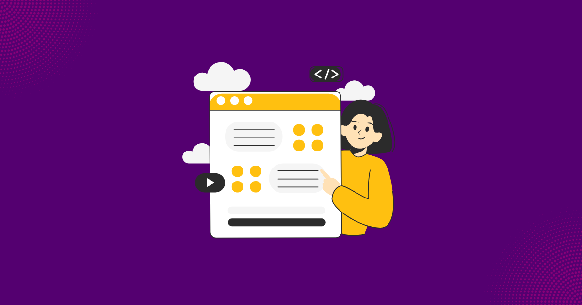
Homepage - Build Trust in 5 Seconds
Your homepage has one job: make visitors trust you enough to browse your products. That is it. Within 5 seconds, a visitor should know three things: what you sell, why they should care, and where to go next.
Above the Fold
Clear brand message. Not a vague tagline like "Live Your Best Life." Something specific like "Organic Skincare for Sensitive Skin" or "Premium Dog Treats Made in the USA." Show your best-selling product or collection, not a generic lifestyle banner. One clear CTA button: "Shop Now" or "See Best Sellers."
Navigation
Maximum 5-7 main menu items. Not 15. Use category names your customer uses, not industry jargon. On mobile, the hamburger menu is fine, but make sure it opens fast and items are easy to tap.
Trust Signals
Show them below the fold: customer review count or average rating, press mentions if you have them, shipping and return policy summary, customer count or other social proof. Visitors need reasons to trust you before they buy from you.
Common Mistakes
Autoplay video that slows the page. Multiple popups on arrival. A carousel with 5 different messages (nobody reads past slide 1). Beautiful design but no clear path to products.
| Element | What to Check | Standard |
|---|---|---|
| Brand message | Clear in first 5 seconds? | Specific, not vague |
| Hero image | Shows product, not stock photo? | Best seller or collection |
| Primary CTA | One clear action above the fold? | Single, visible button |
| Navigation | Simple, clear category names? | 5-7 items maximum |
| Trust signals | Reviews, policies, social proof? | Visible below the fold |
| Mobile speed | Loads under 3 seconds on cellular? | Test with real cellular data |
| Popups | Maximum 1, delayed, easy to close? | 10+ second delay |
Key Insight: Your homepage is not an art gallery. It is a front door. Visitors should know what you sell, trust your brand, and find a product within 5 seconds. If they cannot, they leave.
Collection Pages - Help Visitors Find the Right Product
A visitor who reaches your collection page is interested. They want to see your products. Your job is to help them find the right one fast. Good Shopify store optimization means making this easy. If they cannot find the right product in 30 seconds, they leave.
Product Photos
Consistent style across all products. White background OR lifestyle shots. Do not mix randomly. High quality even on mobile. The first photo should show the product clearly at a glance. If a visitor cannot tell what the product is from the thumbnail, you have a problem.
Sorting
Set your default sort to "Best Selling." Your best sellers have the highest conversion rate. Showing them first means more visitors see your strongest products. This is a 15-second change that can optimize Shopify store for sales immediately.
Filtering
Essential filters: price range, size, color, type. Do not add 20 filter options. 3-5 relevant filters are enough. On mobile, filters should be easy to access, not buried at the bottom. Test this: if a customer wants "blue running shoes under $100," can they find it in under 15 seconds?
Product Cards
Show product name, price, and star rating on the card. Visitors should not need to click into a product just to see the price. Quick-view or quick-add buttons reduce clicks and reduce drop-off. On mobile, use a 2-column grid with easy scrolling.
Tip: Sort your collection pages by "Best Selling" as the default. Your best sellers have the highest conversion rate. Showing them first means more visitors see your strongest products. This is a 15-second change that works immediately.
Search - The Conversion Tool Most Stores Ignore
Here is a fact most merchants do not know: visitors who use your site search convert 2-3x higher than visitors who only browse. These are your highest-intent visitors. They know what they want and they are ready to buy.
Yet most Shopify stores have poor search and never test it.
Test Your Search Right Now
Try these tests on your own store:
- Misspellings: Search for a common misspelling of your product name. Does it still find the right product?
- Synonyms: Search for an alternative name (like "sneakers" instead of "running shoes"). Do relevant products appear?
- Partial matches: Start typing a product name. Does autocomplete help?
- No results page: Search for something you do not sell. What happens? If you see an empty page with "No results found," that is a dead end for your visitor.
Fix Your "No Results" Page
Never leave it empty. Show popular products, best sellers, or category links. A dead "no results" page means you lost a high-intent visitor for nothing.
Check Search Analytics
Look at what customers search for. If they search for products you carry but your search cannot find them, fix your search. If they search for products you do not carry, that is valuable product development data.
Key Insight: Search users are your highest-intent visitors. They know what they want and they are ready to buy. If your search cannot handle a misspelling or find a product by a common name, you are sending your best potential buyers to a dead end.
How to Increase Shopify Conversion Rate: The 4-Step Framework
The step-by-step framework that takes stores from 1% to 4% conversion rate. ICP, store experience, product pages, and behavioral intelligence - in the right order.
Cart Drawer - The Bridge to Checkout
A visitor just added something to cart. This is a big moment. They showed real interest. Now your cart drawer has one job: get them to checkout. If you want a high converting Shopify store, do not make this complicated.
What to Show
- Product details: Image, name, selected variant (size, color), quantity, price
- Subtotal: Clearly displayed, no surprises
- Shipping info: "Free Shipping" or "Free shipping on orders over $X" or estimated cost
- Checkout button: High contrast color, full width on mobile, prominent text
What NOT to Add
Aggressive upsells that distract from checkout. Surprise fees that were not visible before. Too many buttons and options that create confusion. Small text or cluttered layout.
Free Shipping Threshold
If you offer free shipping above a certain amount, a progress bar works well. "You are $15 away from free shipping" motivates higher order values. But keep it subtle. The checkout button should still be the most prominent element.
Tip: The cart drawer has one job: get the visitor to checkout. Show the product, show the total, show the checkout button. Every element that does not support this goal is a distraction. Keep it clean.
General Store Experience - The Details That Matter
Beyond individual pages, the overall shopify store optimization matters. These details affect every visitor on every page.
Page Speed
Test your store at Google PageSpeed Insights. Aim for a mobile score of 50 or higher. Under 3-second load time on mobile is the target. Every additional second loses visitors. The most common speed killers: uncompressed images, too many apps, and heavy theme code.
Popup Strategy
Maximum one popup per session. Delay it by at least 10-15 seconds. Make the X button big enough to tap on mobile. Never show a popup immediately on landing. That tells visitors "I care about your email more than your shopping experience."
Trust Signals
Secure checkout badge in the footer. Return policy link accessible from any page. Contact information visible. Physical address or "About Us" page accessible. Visitors who cannot find how to contact you assume you are not a real business.
Design Consistency
Same fonts, colors, and image style throughout your store. Inconsistency looks unprofessional and reduces trust. If your homepage uses lifestyle photos but your product pages use white backgrounds, it feels like two different stores.
Shipping and Returns
Visible from every page. Short, clear language. "Free returns within 30 days" beats a 3-page policy document. Your visitors should never need to search for this information.
| Category | Element | Standard |
|---|---|---|
| Speed | Mobile load time | Under 3 seconds |
| Speed | PageSpeed score | 50+ mobile |
| Popups | Number per session | Maximum 1 |
| Popups | Delay before showing | 10+ seconds |
| Trust | Return policy visibility | Accessible from every page |
| Trust | Contact information | Findable in 2 clicks |
| Design | Visual consistency | Same fonts, colors, image style |
| Shipping | Policy clarity | Visible before checkout |
Warning: If your store shows an email popup the moment someone lands, you are telling visitors "give me your email" before they even know what you sell. Delay popups by at least 10 seconds. Let visitors browse first. Earn the right to ask.
Learn From Your Competitors
You are not building a high converting Shopify store in a vacuum. Your customers compare you to 3-5 other stores before they buy. You need to know what they see when they visit those stores.
What to Check
Visit 3-5 competitor stores on your phone. Go through the full shopping experience: find a product, add to cart, check shipping info. Note what they do better than you. Be honest with yourself. Also note what you do better. Those are your competitive advantages.
Ad Research
Go to Facebook Ad Library and search for your competitors. What products do they promote? What messaging do they use? What offers? Check their landing pages. Do their ads match their store experience?
Review Mining
Read their reviews on Google, Trustpilot, or their own site. What do their customers complain about? Those complaints are opportunities for you. If competitors get bad reviews for slow shipping, make your fast shipping visible everywhere.
The goal is not to copy competitors. The goal is to understand what your customers expect based on their experience with other stores. If a competitor offers free shipping, free returns, and fast delivery, your customers expect similar standards from you. Knowing this is key to Shopify store optimization that actually works.
Growth Suite's behavioral tracking shows how visitors who may have already seen competitor stores navigate YOUR store. Where they drop off tells you where you fall short compared to their expectations.
7 Best Shopify Conversion Rate Apps: Build the Right Stack for Your Store
One best-in-class tool per category. No overlaps, no gaps. 7 apps compared with honest pros, cons, and pricing so you can pick the right combination for your budget and biggest problem.
What if every discount went to the right person?
Growth Suite predicts purchase intent and shows time-limited offers only to visitors who need them.
In This Article
References & Sources
Research and data backing this article
Muhammed Tüfekyapan
Founder of Growth Suite
Muhammed Tüfekyapan is a growth marketing expert and the founder of Growth Suite, an AI-powered Shopify app trusted by over 300 stores across 40+ countries. With a career in data-driven e-commerce optimization that began in 2012, he has established himself as a leading authority in the field.
Stop giving discounts to everyone.
Growth Suite watches each visitor, predicts purchase intent, and makes one real, time-limited offer—only to those who need it.
Try Free for 14 DaysContinue Reading
More articles you might enjoy

Shopify Ideal Customer Profile: Know Your Buyer Before You Optimize (2026)
Shopify Product Page Conversion: The Desire vs Friction Framework (2026)

Shopify Conversion Rate Not Improving? The UX Ceiling and What Comes Next (2026)
Checkout Conversion: Why Shopify Visitors Start But Don't Finish (2026)
Understanding Your Shopify Visitors: The Behavioral Intelligence Guide (2026)
Best Shopify Conversion Rate Apps: 7 Tools That Actually Work (2026)
Frequently Asked Questions
Common questions about this topic