3 Product Page Tweaks You Can Make in 10 Minutes
 By Muhammed Tüfekyapan
You have read the "50 Product Page Best Practices" article. You bookmarked it. You felt motivated for about four minutes. Then you looked at your own store, felt overwhelmed, and changed nothing.
Most product page optimization advice assumes you have a design team, a copywriter, and a free afternoon. You probably have none of those. The result is predictable: your product pages stay exactly the same for months while your conversion rate stays flat.
This post takes a different approach. Instead of a sprawling checklist, it covers three specific product page tweaks - each under 10 minutes - that target the moments where visitors actually decide to buy or leave. No redesign. No code. No developer needed.
Here is what we will cover:
- Fix your first product image (above the fold)
- Rewrite the first line of your product description
- Add a simple social proof element
Where Visitors Actually Look on a Product Page
Before making any changes, it helps to understand where attention actually goes. Eye-tracking studies from Nielsen Norman Group show that visitors spend roughly 80% of their attention above the fold during the first 3-5 seconds on a page. That narrow strip of screen real estate - the product image, product title, price, and the first line of the description - forms what we call the "decision zone."
If those elements fail to communicate value quickly, no amount of brilliant copy below the fold will save the sale. This is especially true on mobile, where over 70% of Shopify store traffic now originates. Most mobile visitors never scroll past the first screen. They glance, they judge, and they either stay or tap the back button.
Google's page experience research confirms this pattern: visitors form their first impression of a product page in under 3 seconds, and that impression largely determines whether they scroll or bounce. The three product page tweaks in this post all target this critical decision zone because that is where the highest leverage lives.
So where do you start? With the single largest element on the page: your product image.
Tweak 1 - Make Your First Product Image Do the Selling (5 Minutes)
The Problem
Many Shopify stores use the same manufacturer-provided flat-lay or white-background photo as their hero image. The first image is the single most influential element on a product page, yet most merchants treat it as an afterthought. On mobile, the hero image takes up nearly the entire screen - it is the first (and sometimes only) thing a visitor sees before deciding to keep scrolling.
The 5-Minute Fix
Swap your first image from a plain product shot to a "product in context" or lifestyle shot. If you only have flat-lay photos, reorder your gallery so the most visually compelling image is first. You can also crop or reframe the image to remove excess white space, which makes a noticeable difference on mobile screens.
Before and After
- Before: White-background photo of a candle jar, centered with too much empty space around it
- After: Same candle on a nightstand next to a book and warm lighting - instantly communicates the "cozy evening" use case
Why It Works
Context images help visitors picture the product in their own life. When someone sees a candle on a nightstand rather than floating in a white void, they stop evaluating the object and start imagining the experience. Reducing white space also makes the product feel larger and more premium on mobile. Most importantly, the hero image sets the emotional tone before a single word is read.
Your hero image is not a product photo. It is a silent sales pitch. Make it sell.
Quick Checklist
- Does my first image show the product being used or in a real setting?
- Is the product clearly visible without zooming on mobile?
- Does the image communicate a feeling, not just an object?
Tweak 2 - Lead Your Description with a Benefit, Not a Feature (3 Minutes)
The Problem
Most product descriptions open with materials, dimensions, or technical specs. Visitors scanning on mobile see only the first 1-2 lines before the "Read More" truncation. If those lines read "100% organic cotton, 180 GSM weight," the visitor learns nothing about why they should care. The specs matter, but they are not the hook.
The 3-Minute Fix
Rewrite only the first sentence of your product description. Use this structure: [Benefit for the customer] + [what the product does to deliver that benefit]. Keep it under 20 words. That is it. You are not rewriting the entire description - just the opening line.
Before and After Examples
Skincare:
- Before: "A lightweight daily moisturizer with hyaluronic acid and vitamin E."
- After: "Wake up to softer skin every morning - this lightweight moisturizer locks in hydration for 24 hours."
Backpack:
- Before: "600D polyester, 28L capacity, padded laptop compartment, YKK zippers."
- After: "Carry your full workday without the shoulder pain - designed for laptops up to 16 inches with weight-distributing straps."
Coffee:
- Before: "Single-origin Ethiopian Yirgacheffe, medium roast, whole bean, 12 oz bag."
- After: "Bright, fruity, and smooth enough to drink black - single-origin Ethiopian beans roasted in small batches."
Why It Works
Benefits answer "What does this do for me?" - the question every visitor is silently asking. Features still matter. They just belong in the second or third line, after you have the visitor's attention. The first line of your product description copywriting is your only guaranteed read on mobile. Make it count.
Quick test: Read your first line aloud. Does it describe the product or the customer's experience? If it describes the product, rewrite it.
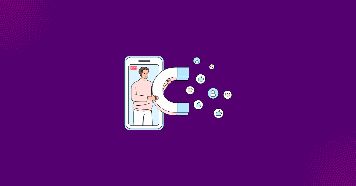
Tweak 3 - Add One Social Proof Signal Above the Fold (5 Minutes)
The Problem
Many product pages have reviews buried at the bottom, or no visible social proof at all. A visitor landing on a product page for the first time has zero evidence that anyone else has bought and liked this product. Window shoppers especially rely on external validation before committing to a purchase. Without it, they are far more likely to leave.
The 5-Minute Fix
Add one visible social proof element near the product title or price. Pick one of these options:
- Star rating + review count (e.g., "4.8 stars from 214 reviews")
- "X people bought this in the last 30 days" counter
- A single short customer quote pulled from your best review
Where to Place It
Place it directly under the product title or directly above the "Add to Cart" button. It must be visible without scrolling on both desktop and mobile. Most Shopify review apps - Judge.me, Loox, Stamped - allow you to position a star-rating widget in this exact spot with a few clicks. No code required.
Before and After
- Before: Product title, price, variant selector, Add to Cart button - no social proof visible anywhere above the fold
- After: Product title, "4.7 stars - 189 reviews" (clickable, scrolls to reviews section), price, Add to Cart button
Why It Works
Research from the Spiegel Research Center shows that social proof on product pages increases conversion rates by 15-20% on average when placed near the purchase action. A star rating next to the price reframes the cost as "validated" rather than "unproven." Even a modest review count of 20 or more signals that real people have purchased and had a positive experience.
Important note: If you have fewer than 5 reviews for a product, skip the star rating for that product and use a different signal instead - a "Bestseller" badge or "New Arrival" tag. Low review counts can actually hurt more than they help by highlighting the lack of social proof rather than building confidence.
The Real Reason These Tweaks Get Ignored
Most merchants skip small, high-leverage changes because they feel too simple to matter. There is a bias toward big redesigns and major overhauls. The logic seems sound: if the results are going to be meaningful, the effort should be significant too. But that logic is backwards.
The visitors who leave your product page without buying are not thinking "this store needs a redesign." They are thinking "I am not sure this product is for me." That uncertainty lives in the first 3 seconds, in the decision zone we discussed earlier. A full redesign six months from now does not fix what is happening today.
The "big project" mindset causes merchants to postpone improvements indefinitely. Meanwhile, the product page stays untouched for 6-12 months while small, compounding improvements would have beaten one annual overhaul. The three quick improvements in this post address the three core questions every visitor asks silently:
- "What does this look like in real life?" - answered by your hero image
- "What does this do for me?" - answered by your first description line
- "Have other people bought this and liked it?" - answered by your social proof
Once your product page answers those three questions above the fold, you have done more than most stores ever will. And if you want to take it one step further, the next section covers what comes after.
After the Tweaks - Turning Browsers into Buyers
These three changes improve first impressions. But some visitors still need more time or a nudge before they commit. The window shoppers who linger, browse multiple products, and add items to cart without checking out - they are interested, just not fully convinced yet.
This is where personalized, well-timed offers can make the difference between a lost visitor and a sale. Growth Suite tracks how each visitor behaves on your store in real time - pages viewed, time spent, products explored - and identifies who is likely to buy and who is likely to leave. For visitors who show interest but stall, it can present a personalized, time-limited offer at the right moment.
The key distinction matters: dedicated buyers with strong purchase intent should not see discounts. That simply wastes margin. The offer is reserved for the walk-away customer who needs one final reason to commit. By separating these two groups, you protect your margins while still recovering sales that would otherwise walk out the door.
The Bottom Line
You do not need a redesign to improve your product page. You need 10 minutes and three focused changes:
- Swap your hero image to show the product in context
- Rewrite the first line of your description to lead with a benefit
- Add a visible social proof element above the fold
These product page tweaks target the decision zone where visitors choose to stay or leave. They address the three silent questions every shopper asks before scrolling further. And they can all be done through Shopify's admin panel without writing a single line of code.
The best product page changes are the ones that actually get made. Pick one tweak, make it today, and measure the result next week.
Start with whichever tweak feels easiest and build from there. Once your product page is doing its job, Growth Suite helps you convert the visitors who still need a nudge - with personalized offers that expire when the timer runs out, so the urgency is real and margins stay protected.
Frequently Asked Questions
What is the most important part of a product page?
The above-the-fold area - specifically the hero image, product title, price, and the first line of the description. Visitors form their impression within 3 seconds, and on mobile, this area is often all they see before deciding to scroll or leave. Focus your improvements here for the biggest impact on conversions.
How do I write a better product description quickly?
Start by rewriting only the first sentence. Replace technical specs with a clear benefit statement. Use this formula: what the customer experiences + how the product delivers it. Keep it under 20 words. Features like materials and dimensions belong in the second or third line, after you have earned the visitor's attention.
Does social proof really increase conversions?
Yes. Star ratings, review counts, and purchase counters reduce the perceived risk of buying from an unfamiliar brand. Research from the Spiegel Research Center shows social proof can increase conversions by 15-20% when placed near the purchase action. Even a modest number of reviews (20+) signals that real customers have bought and approved the product. Place social proof above the fold, near the price or Add to Cart button, for best results.
Do I need a developer to make these product page changes?
No. All three tweaks can be done through Shopify's admin panel and your review app's settings. Reordering product images, editing description text, and placing a star-rating widget are all code-free tasks that take minutes. Most Shopify review apps like Judge.me, Loox, and Stamped offer drag-and-drop placement for their rating widgets.
References
- Nielsen Norman Group - Eye-Tracking Research on Web Page Attention
- Google/SOASTA - Page Load and First Impression Research
- Shopify Commerce Trends - Mobile Traffic Data
- Spiegel Research Center - Impact of Social Proof on Conversion
- Baymard Institute - Product Page UX Research
- ConversionXL - Above-the-Fold Optimization Studies
Ready to Implement These Strategies?
Start applying these insights to your Shopify store with Growth Suite. It takes less than 60 seconds to launch your first campaign.
Muhammed Tüfekyapan
Founder of Growth Suite
Muhammed Tüfekyapan is a growth marketing expert and the founder of Growth Suite, an AI-powered Shopify app trusted by over 300 stores across 40+ countries. With a career in data-driven e-commerce optimization that began in 2012, he has established himself as a leading authority in the field.
In 2015, Muhammed authored the influential book, "Introduction to Growth Hacking," distilling his early insights into actionable strategies for business growth. His hands-on experience includes consulting for over 100 companies across more than 10 sectors, where he consistently helped brands achieve significant improvements in conversion rates and revenue. This deep understanding of the challenges facing Shopify merchants inspired him to found Growth Suite, a solution dedicated to converting hesitant browsers into buyers through personalized, smart offers. Muhammed's work is driven by a passion for empowering entrepreneurs with the data and tools needed to thrive in the competitive world of e-commerce.
More Insights from Our Blog
Continue reading for more expert tips and strategies to grow your Shopify store

2026 Wrap-Up: 6 E-commerce Shifts That Will Define the Second Half
The 6 ecommerce shifts that defined H1 2026 - agentic commerce, GEO, social checkout, returns, value-seeking shoppers - and what to act on before Q4.

Back-to-School Starts Now: Why Late June Is the Smart Time to Plan
Two-thirds of shoppers start back-to-school buying by early July. Here is the late-June planning timeline smart Shopify merchants use to get ahead.

The Half-Year Metric That Matters More Than Revenue Growth
Revenue growth can hide a shrinking business. Here is the mid-year metric that actually tells you whether your Shopify store is getting healthier.