Product Recommendation Placement Strategy: Where Suggestions Actually Convert
Learn where to place product recommendation widgets across your Shopify store for maximum clicks. Covers product pages, collection pages, homepage, cart drawer, and mobile-first placement rules.

Muhammed Tüfekyapan
Key Takeaways
- 1 Placement determines visibility, and visibility determines clicks. The same recommendation widget in a different location can get two to three times more clicks.
- 2 Below the fold on product pages is the highest-converting position for FBT recommendations. Customers who scroll past the product details are engaged and open to suggestions.
- 3 Collection page recommendations reduce decision fatigue. Highlighting 3-4 trending products from a catalog of 50 accelerates the path to a product page and to purchase.
- 4 For returning visitors, a Recently Viewed section on the homepage is one of the highest-converting recommendation placements. These customers already showed interest - bring them back immediately.
- 5 Cart recommendations should be small, low-friction add-ons priced under 25% of the cart total. One-click addition is critical - any extra steps kill the impulse.
- 6 More than 60% of Shopify traffic is mobile. Recommendations must live in the natural scroll path - no tabs, no collapsed sections, no hidden panels that require a tap to expand.
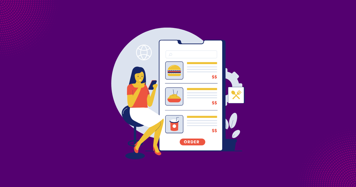
You installed a recommendation widget. You put it on your product page. Nobody clicks on it. Sound familiar? The problem is not your algorithm. The problem is product recommendation placement. The same widget in a different location can get two to three times more clicks. Placement is the most underrated factor in recommendation performance.
Most Shopify stores use one placement: below the product description. That is a starting point. It is not a product recommendation strategy. A complete strategy places different widget types across five locations: product page below the fold, product page sidebar, collection pages, homepage, and cart page or drawer. This guide covers each one. You will learn where to put product recommendations so customers actually see them and click.
Tip: Moving a recommendation widget from a hidden tab to the main scroll path can double or triple click-through rates. Before testing new algorithms, test new placements first. A solid where to put product recommendations plan matters more than which algorithm you use.
Product Page Placements - Below the Fold and Sidebar
The product page is where most merchants start with product recommendation placement. But there are two distinct positions here. Each serves a different purpose. Understanding both is key to a strong upsell placement strategy.
Below the Fold
Below the fold means below the product description, reviews, and details. This is the most common where to put product recommendations answer - and for good reason. Customers who scroll this far are engaged. They are actively considering the purchase. They are open to seeing what goes with it.
This is the best spot for "Frequently Bought Together" and "Complete the Look" widgets. These show complementary products that pair with the item the customer is viewing. A customer looking at running shoes sees performance socks and a water bottle. The cross sell product page placement below the fold is the highest-converting position for FBT recommendations.

Sidebar
Sidebar placement works on desktop for "You May Also Like" or "Related Products." This cross sell product page placement gives customers an alternative browsing path. They can explore similar items without leaving the current product context.
Here is the problem. On mobile, sidebars collapse into stacked content below the main product area. The sidebar becomes just another below-the-fold section - but positioned after the actual below-fold FBT widget. Customers have to scroll even further to reach it.
Best practice: use below the fold for your primary recommendation widget placement. Reserve the sidebar for secondary recommendations. Accept that mobile users may not reach the sidebar position.
| Factor | Below the Fold | Sidebar |
|---|---|---|
| Visibility | High - in natural scroll path | Medium - desktop only effective |
| Best Widget Type | FBT, Complete the Look | Related Products, You May Also Like |
| Typical CTR | 3-5% click-through rate | 1-2% click-through rate |
| Mobile Behavior | Stays in scroll path | Stacks below main content |
| Best For | Complementary products | Alternative browsing |
Key Insight: Below the fold on product pages is the highest-converting position for FBT recommendations. Customers who scroll past the product details are engaged and actively considering their purchase. Show them what goes with it.
Collection Page Recommendations
Collection pages represent a fundamentally different intent. On a product page, the customer already chose what to look at. On a collection page, they are still deciding. Your product recommendation strategy needs to reflect that difference.
The right recommendation type for collections is not FBT. There is no anchor product to pair with. Instead, use "Popular in This Category" or "Trending in [Collection Name]." These highlight products with proven performance. They help guide the browsing process for window shoppers who need direction.
Knowing where to put product recommendations on collection pages is simple. Place them at the top of the collection - above the product grid. Or insert them between product rows. Either position catches the eye without hijacking the browsing experience.
Keep it focused. Three to four highlighted products is enough for any shopify recommendation placement on collection pages. A full row of eight to ten recommended products competes with the collection itself. It creates visual noise instead of clarity.
The goal of collection page product recommendation placement is to reduce decision fatigue. When a customer is browsing 50 products in a category, pointing them toward the top three or four trending ones accelerates the path to a product page. And from there, to purchase.
Key Insight: Collection page recommendations help undecided shoppers. When a customer is browsing 50 products, highlighting the 3-4 trending ones reduces decision fatigue and accelerates the path to purchase.
Homepage Recommendations
The homepage serves two very different audiences. First-time visitors and returning customers. Your product recommendation strategy should address both.
For first-time visitors, "Trending Products" or "Best Sellers" create immediate engagement. These widgets communicate store vitality. Real people are buying real products here. They also give visitors an instant path to a product page. That is the goal of every homepage product recommendation strategy.
For returning visitors - which often represent 60% or more of your traffic - "Recently Viewed" is one of the highest-converting recommendation widget placements. These customers already showed interest in specific products during a previous session. Bringing those products back immediately removes the friction of searching again.
Personalized recommendations based on browsing history work well for stores with enough traffic. For smaller stores, trending products and recently viewed are more reliable starting points. Either way, your homepage product recommendation placement should serve both audiences.
Place homepage recommendations below the hero banner or featured collection. A single row is usually enough. The goal is visibility without competing with the primary homepage content. This shopify recommendation placement gets visitors off the homepage and onto product pages as quickly as possible.
Tip: For returning visitors, a "Recently Viewed" section on the homepage is one of the highest-converting recommendation placements. These customers already showed interest. Bring them back to those products immediately.
Cart Page and Cart Drawer Recommendations
The cart is the last opportunity to increase order value before checkout. This makes it a high-stakes product recommendation placement. But it also requires a different approach than other locations.
Cart page recommendations work best as "Customers Also Bought" or "Complete Your Order" widgets. This product recommendation strategy differs from product pages in one key way: suggestions are based on the full cart contents, not a single product. A customer with running shoes and a water bottle in their cart might see performance socks or a gym towel.
Cart drawer recommendations follow the same logic in a more compact format. AI-powered suggestions analyze the items already in the cart and recommend relevant add-ons. Single-click addition keeps the experience frictionless. This is where to put product recommendations for maximum impulse conversions.
Here is the golden rule for cart upsell placement strategy. Keep recommendations small and low-friction. The ideal cart add-on is priced under 25% of the total cart value. A $5 product in the cart is an easy yes. A $50 product makes customers reconsider their entire purchase.
Product types that work best in the cart: consumables like refills and supplies. Small accessories like cases, adapters, and care products. Complementary items that enhance the main purchase. This is the right upsell placement strategy for maximizing cart value without creating friction.
One-click "Add to Cart" is critical at this stage. If the customer has to navigate to a product page, read details, and then add to cart, the impulse is gone. The entire value of cart recommendation widget placement depends on frictionless addition. Understanding where to put product recommendations in the cart is only half the equation. Making the add-to-cart action effortless is the other half.

Warning: Cart recommendations should be small, low-friction add-ons. A $5 product in the cart is an easy yes. A $50 product makes customers reconsider their entire purchase. Keep cart add-ons under 25% of the cart total.
Mobile-First Placement Rules
More than 60% of Shopify traffic comes from mobile devices. If your product recommendation placement strategy is designed for desktop first, you are designing for the minority of your visitors.
The thumb zone rule matters. The "Add to Cart" button on any recommendation widget must fall within the natural thumb reach area. If customers have to stretch or reposition their grip to tap "Add to Cart," conversions drop. Every shopify recommendation placement should pass this simple test.
Recommendations must live in the natural scroll path. This is the number one mobile product recommendation placement rule. No tabs. No collapsed sections. No "See More" buttons that hide the widget. If a customer has to tap to expand or switch a tab to see recommendations, most will never see them.
Product count per row matters on mobile. Two to three products per row is optimal for any where to put product recommendations decision on small screens. Four or more products per row creates tiny thumbnails. They are hard to evaluate and impossible to tap accurately.
Horizontal scroll carousels work well on mobile. A row of two to three visible products with more available by swiping is the most space-efficient cross sell product page placement format for small screens.
Load speed is critical. Recommendation widget placement that loads slowly hurts both user experience and search performance. Widgets should render quickly or use lazy loading to appear as the user scrolls down. Apply these rules to every product recommendation strategy you build for mobile.
Warning: If your recommendation widget requires a tap to expand on mobile, most customers will never see it. Recommendations must be visible in the natural scroll path. No tabs, no collapsed sections, no hidden panels.
How Growth Suite Handles Recommendation Placement
A product recommendation strategy only works if your tools make it easy to implement across multiple locations. Growth Suite's recommendation widgets integrate natively with any Shopify theme. They match your store's visual design on both desktop and mobile. No custom coding required.
Placement flexibility is built in. You can add widgets to product pages, collection pages, and the homepage through the Shopify theme customizer. Position, restyle, and manage recommendations directly in the visual editor. This makes testing different shopify recommendation placement positions - including cross sell product page placement - fast and simple.
The cart drawer includes AI-powered suggested products. It analyzes items already in the cart and recommends relevant add-ons. Customers add suggested products with a single click. No page navigation required. This is where to put product recommendations for last-minute order value increases.
Performance tracking works per placement. Growth Suite provides analytics showing views, clicks, add-to-cart rates, and revenue for each recommendation location. This data tells you exactly which product recommendation placement drives the most value. You can double down on what works and adjust what does not.
Every widget adapts automatically to screen size. Desktop and mobile get optimized layouts without separate configuration. That means your upsell placement strategy and product recommendation strategy work across all devices from a single setup.
Key Insight: Growth Suite provides performance analytics per placement - views, clicks, add-to-cart rates, and revenue for each location. This data tells you exactly which placements drive the most value so you can optimize with confidence.
7 Best Shopify Upsell Apps: Touchpoint Coverage Matrix Included
Over 100 upsell apps on Shopify. We compared 7 best across all 4 touchpoints with honest pros, cons, real pricing, and decision frameworks by goal, budget, and store size.
What if every discount went to the right person?
Growth Suite predicts purchase intent and shows time-limited offers only to visitors who need them.
In This Article
References & Sources
Research and data backing this article
Muhammed Tüfekyapan
Founder of Growth Suite
Muhammed Tüfekyapan is a growth marketing expert and the founder of Growth Suite, an AI-powered Shopify app trusted by over 300 stores across 40+ countries. With a career in data-driven e-commerce optimization that began in 2012, he has established himself as a leading authority in the field.
Stop giving discounts to everyone.
Growth Suite watches each visitor, predicts purchase intent, and makes one real, time-limited offer—only to those who need it.
Try Free for 14 DaysContinue Reading
More articles you might enjoy
How to Set Up Frequently Bought Together on Shopify

Trending Products on Shopify: How to Showcase Your Best Sellers

AI vs Manual Product Recommendations: What Performs Better?

Shopify AOV Benchmarks by Industry: Where Does Your Store Stand?

AOV Calculator: Measure and Optimize Revenue Per Order

Best Shopify Upsell & Cross-Sell Apps (2026)
Frequently Asked Questions
Common questions about this topic